
Brand Guidelines
Last updated: August 7, 2023
These guidelines have been created to help understand how to use SwAA brand features correctly, including logos, colors, typography, etc. Templates have been developed to promote the brand voice. All of these are available for download below.
Stand with Asian Americans is the largest coalition of Asian American entrepreneurs, investors, business leaders and activists that are united in our mission to drive justice & equity for all. Anyone can get involved to use their ingenuity and talent to galvanize the next generation of Asian Americans activism.
1.Branding
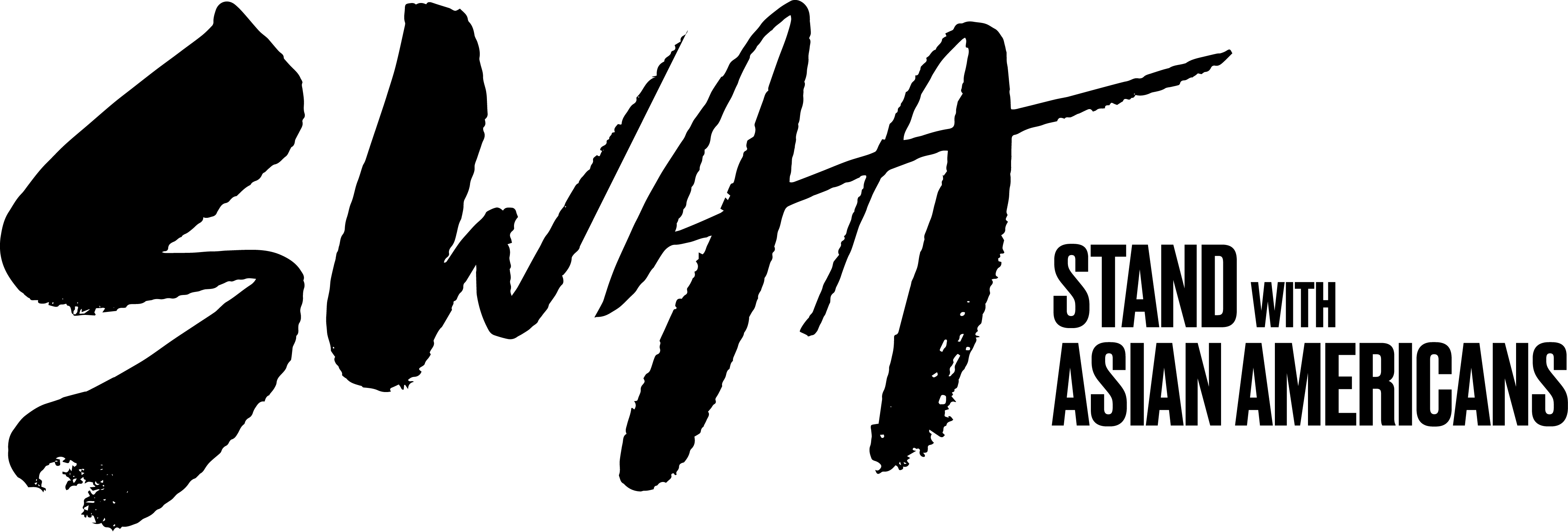
1.01Logo Lockup
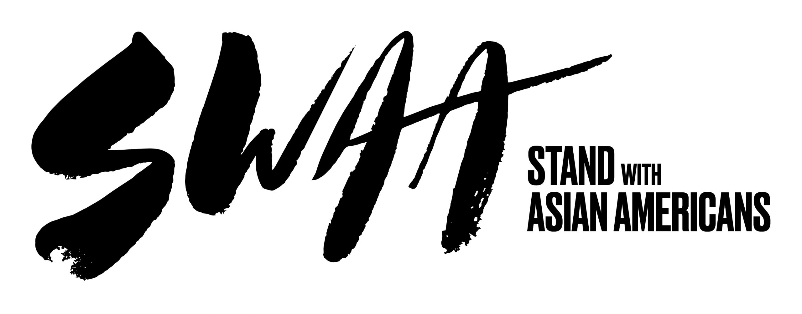
The logo consists of the SwAA logomark and Stand with Asian Americans signature locked to the right of it.
The use of SwAA logo and its supporting elements in accordance with these brand guidelines will promote a clear, consistent brand image.
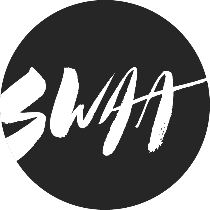
1.02Logomark
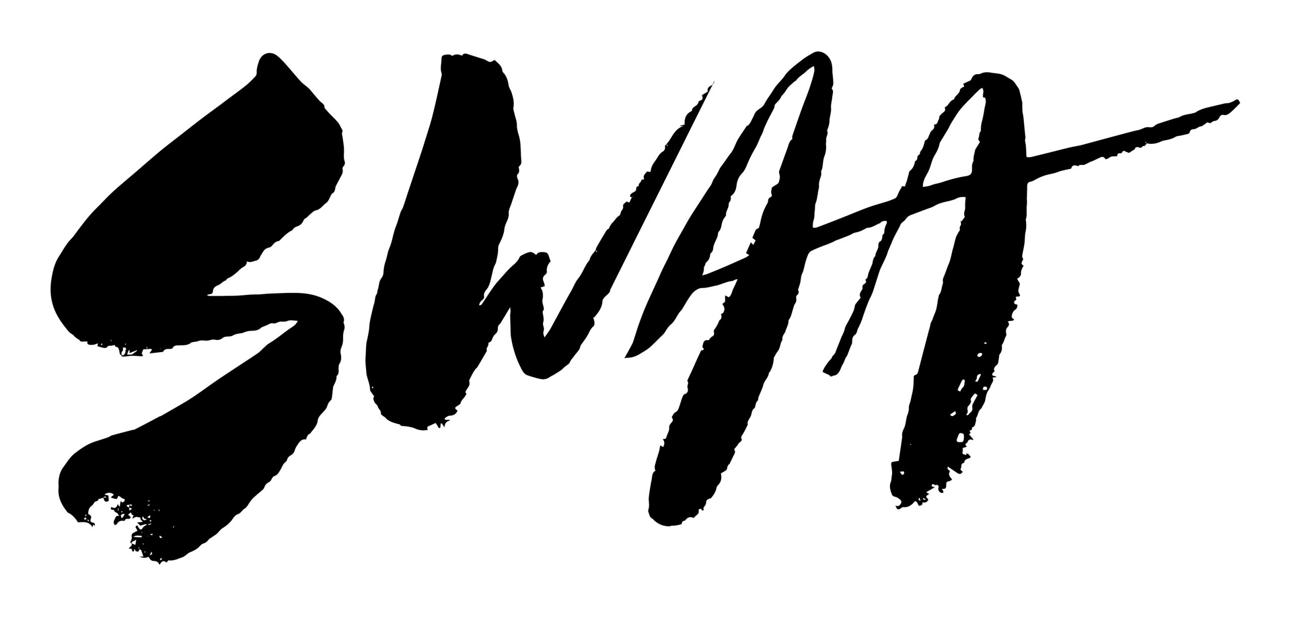
This is the SwAA logomark. The SwAA logomark may be used separately from the full logo.
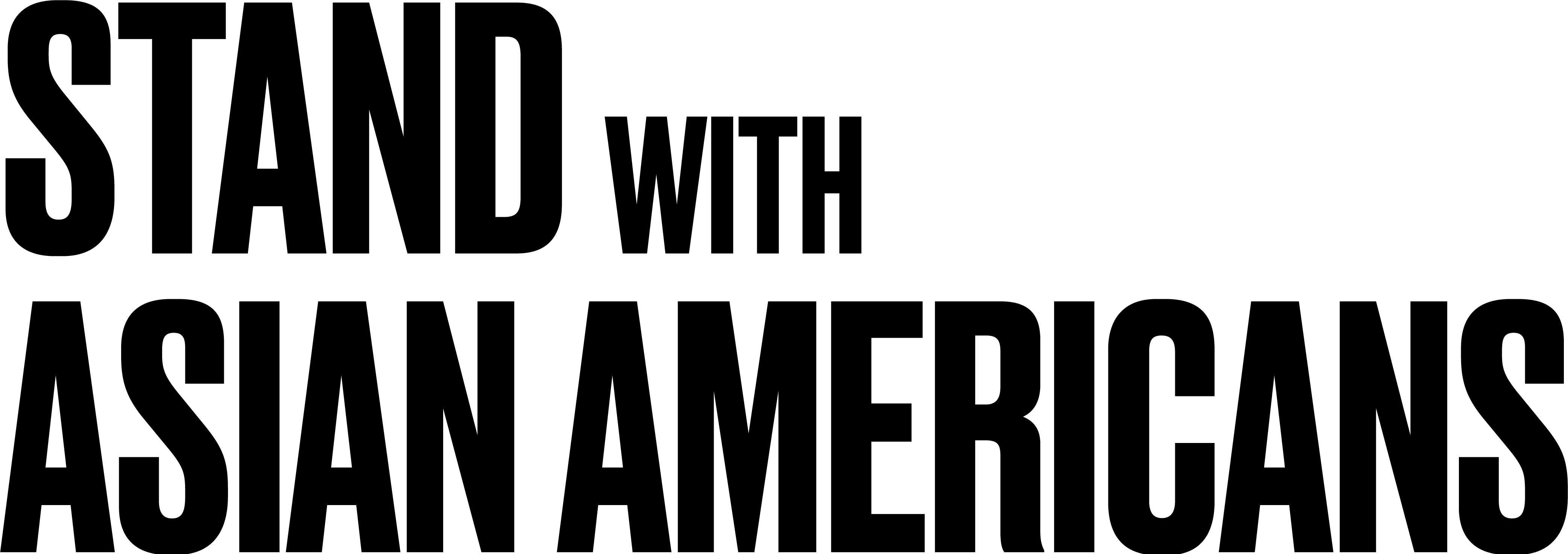
1.03Signature
This is the Stand with Asian Americans signature. The Stand with Asian Americans signature may be used independently from the symbol.
1.04Color Palette
These colors are designed for SwAA. While black is the primary color, SwAA should use the accented colors available to distinguish themselves when needed.
Black
CMYK 70, 67, 63, 70
RGB 38, 36, 37
Hex #262425
Pantone Black C
Red
CMYK 3, 91, 95, 0
RGB 232, 60, 42
Hex #E83C2A
Pantone 179 C
Yellow
CMYK 4, 12, 99, 0
RGB 248, 214, 19
Hex #F8D613
Pantone 115 C
Pink
CMYK 0, 33, 15, 12
RGB 224, 151, 191
Hex #E097BF
Pantone 672 C
Blue
CMYK 58, 3, 18, 0
RGB 97, 194, 208
Hex #61C2D0
Pantone 630 C
Green
CMYK 84, 10, 100, 1
RGB 14, 161, 75
Hex #0EA14B
Pantone 7739 C
Purple
CMYK 50,45,0,0
RGB 140, 142, 253
Hex #8689C3
Pantone 7452 C
2.Typography
2.01Brand Fonts
Signature Font: Druk
Druk is a sans-serif typeface family designed by Berton Hasebe and published through Commercial Type in 2014. Described as a “study in extremes,” Druk was designed without a normal width and nothing lighter than a medium weight; it’s meant to be either heavy and condensed or heavy and wide. The letterforms features flat sides which make it excel in tight settings.
to download
commercialtype.com
Supporting Font: Favorit
ABC Favorit is a straightforward, low-contrast grotesque that combines geometric rigidity with subtle oddities and a humorous touch. It’s available in five weights with corresponding Italics.
to buy
abcdinamo.com
2.02Typographic Hierarchy
Typography is a fundamental part of the SwAA image. It helps communicate an inviting and accessible—yet intelligent and informed—voice in all materials. In order to achieve a balanced look, both Druk and Favorit should be used in conjunction with one another.
Use this as a reference for visual texture and contrast when typesetting across scales and mediums.
Druk
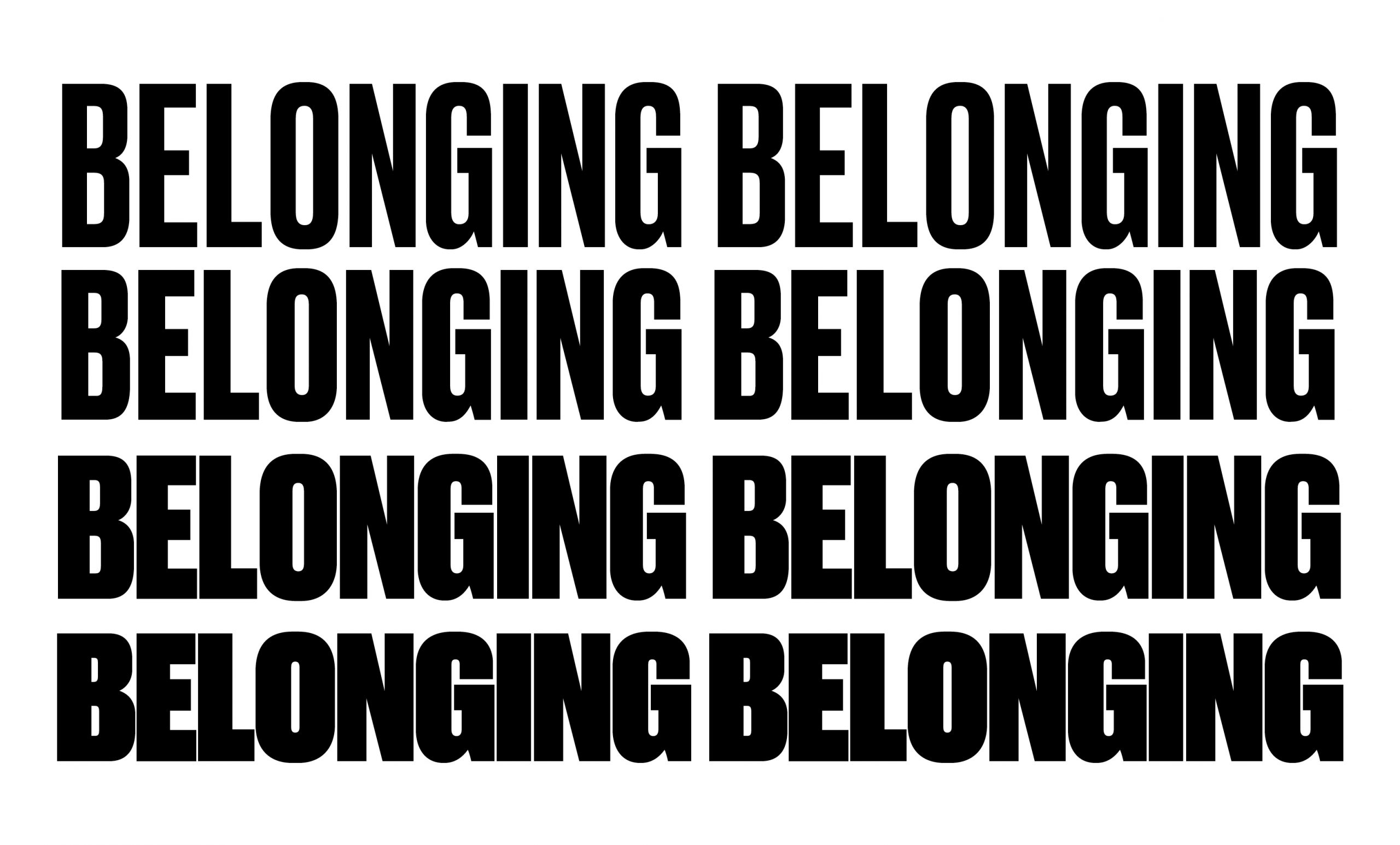
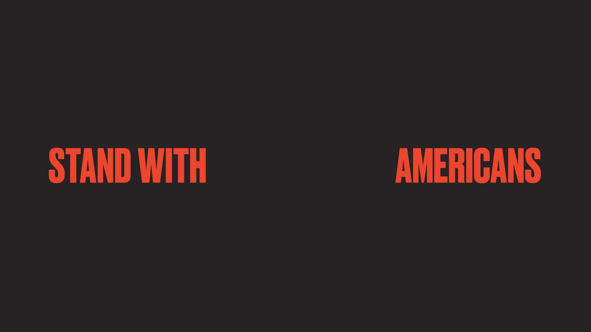
Druk is our graphic and signature typeface. It’s warm and contemporary, intended for large use to set the tone of a website page, communications piece, etc. It is available in several weights, but only Medium, Bold, Heavy, and Super are required to fulfill the brand look-and-feel.
Favorit
Favorit is our supporting font. It’s used across informational and body text. It is a straightforward, low-contrast grotesque that combines geometric rigidity with subtle oddities and a humorous touch. Favorit is available in several weights, but only Light, Regular, Medium, and Bold are required.
3.In Application
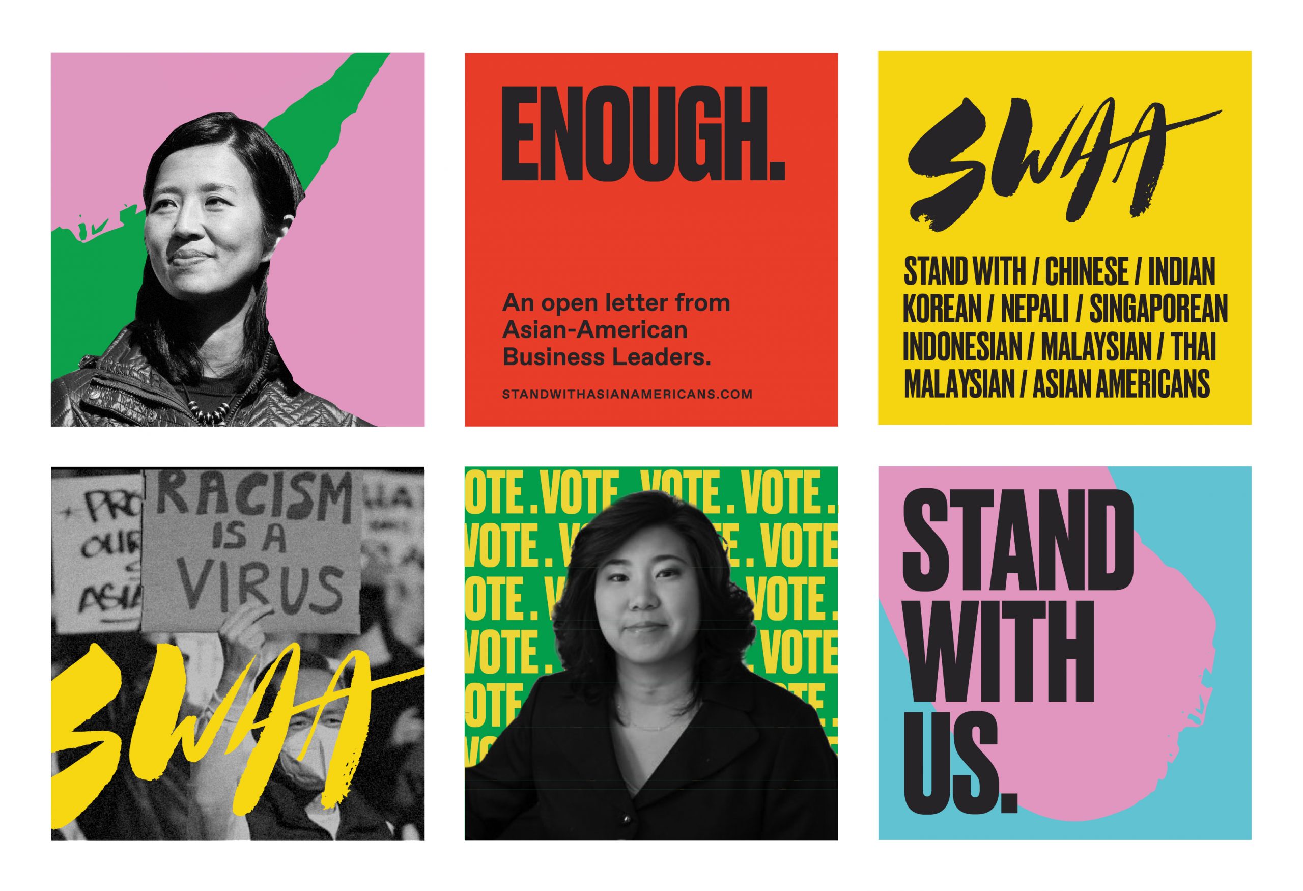
3.02Social Media Content
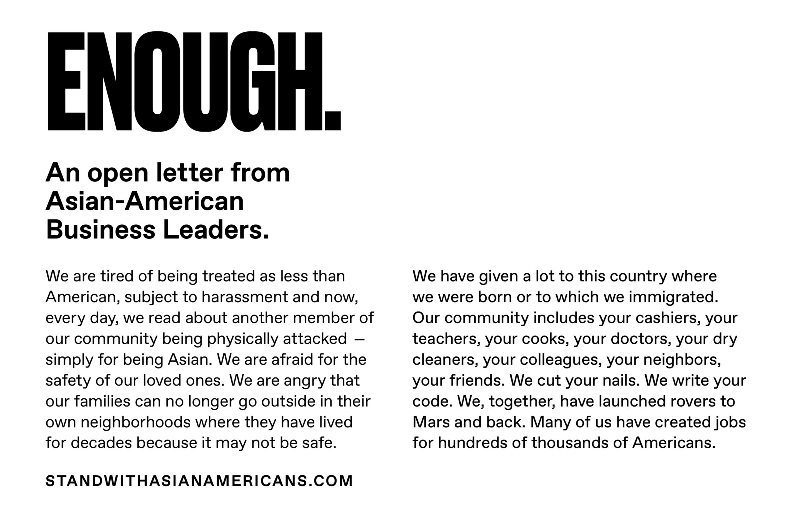
Examples of how typography, colors, and imagery can come together for visual impact.
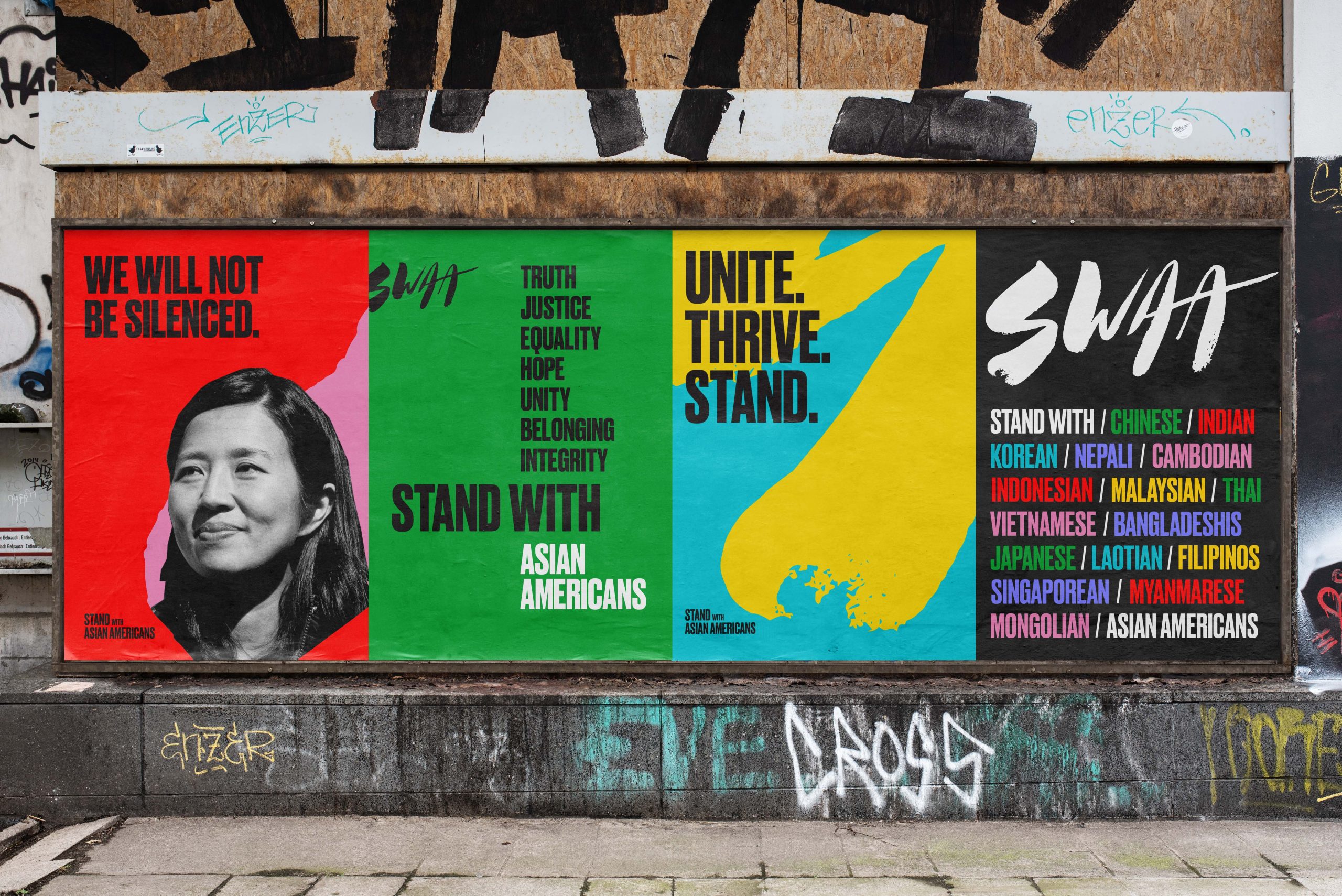
3.03Posters
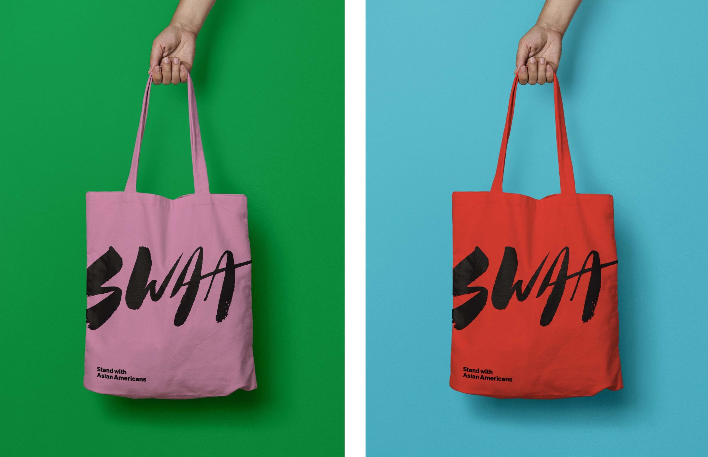
3.04Totebags
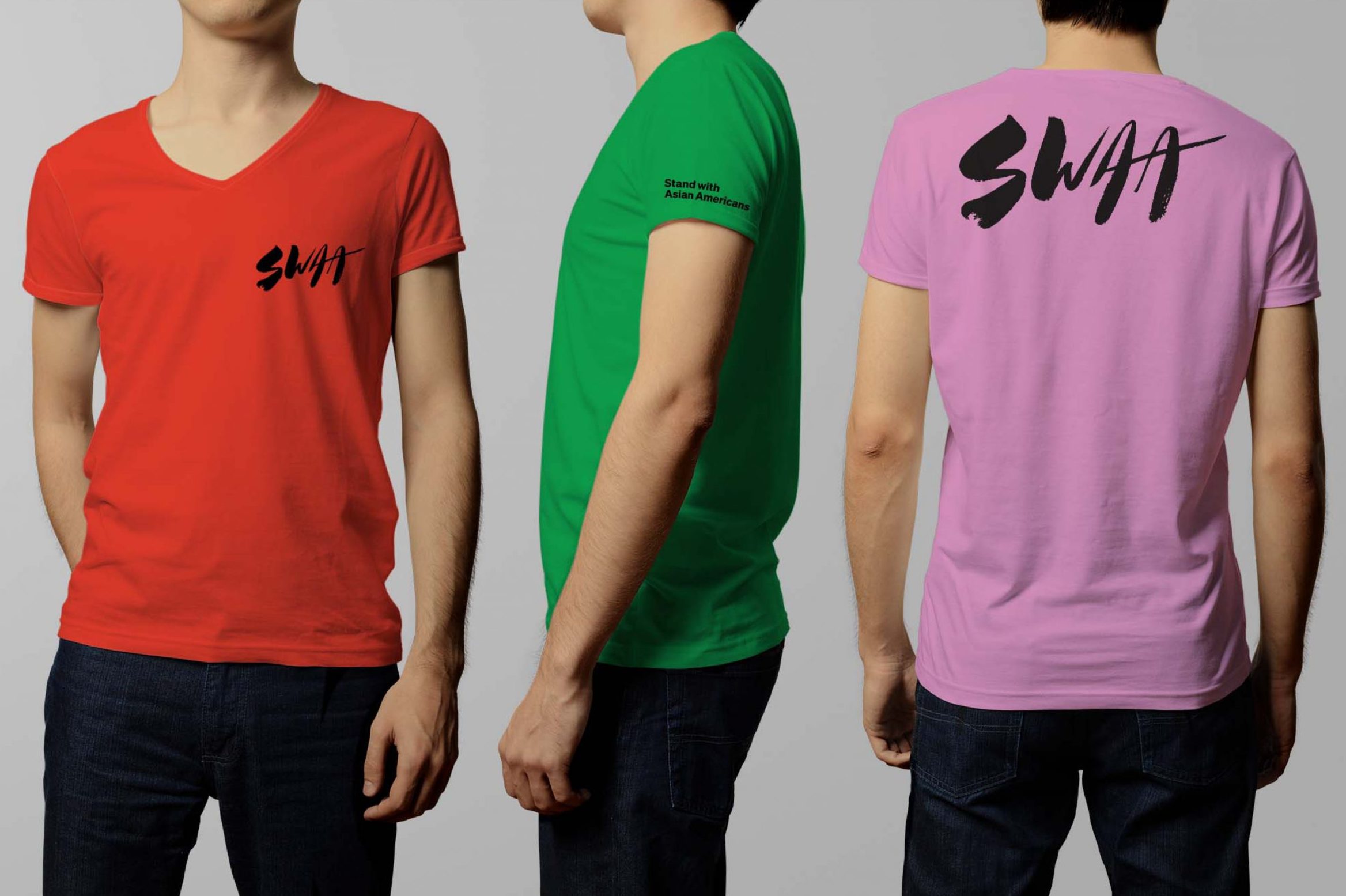
3.05T-Shirt
3.06Brand in Motion
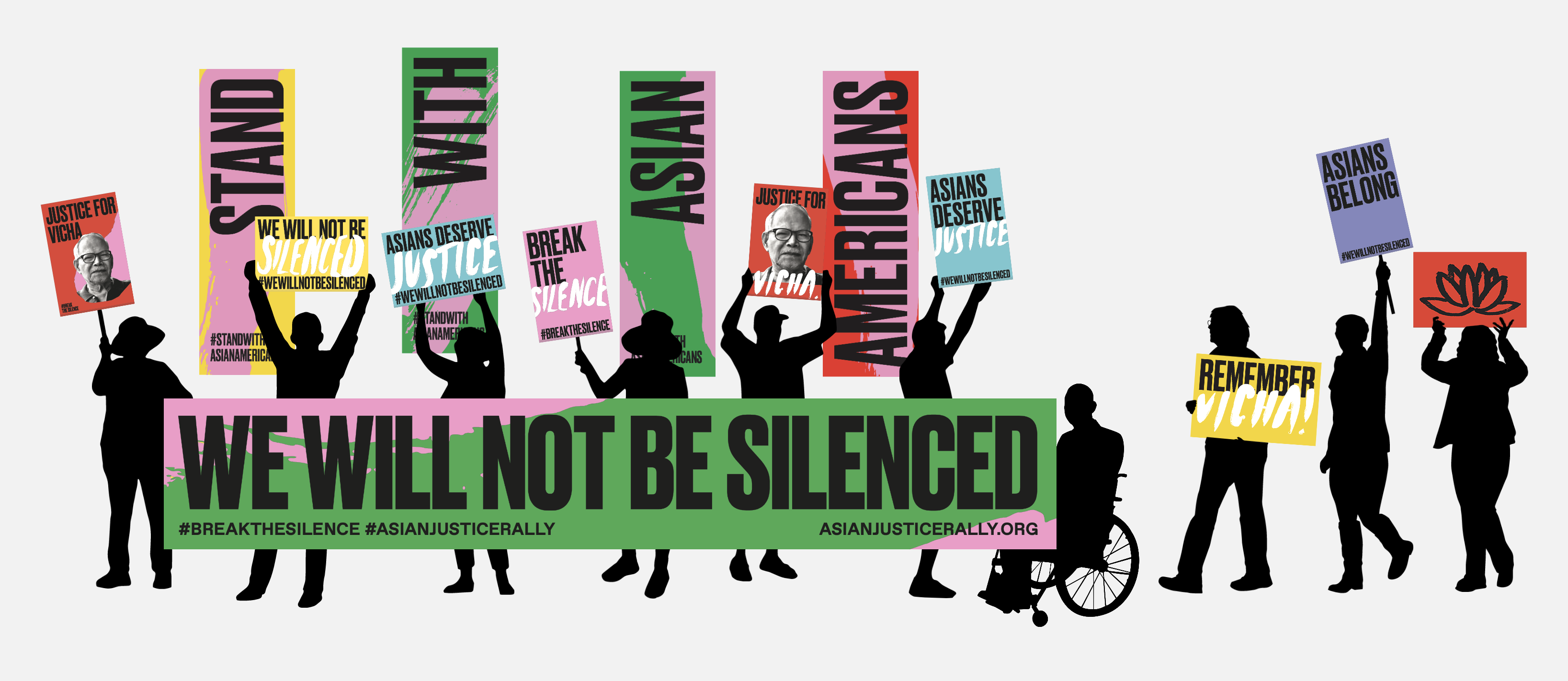
4.Asian Justice Rally


3.01Social Media Logo
Files specifically for social media were designed with aesthetically proper cropping and padding in mind. A black version, as well as color versions, are available for interchangeable use. The signature is not needed since a social avatar is always accompanied by the full name in text. Never place the standard logo on its own, always use the files provided.